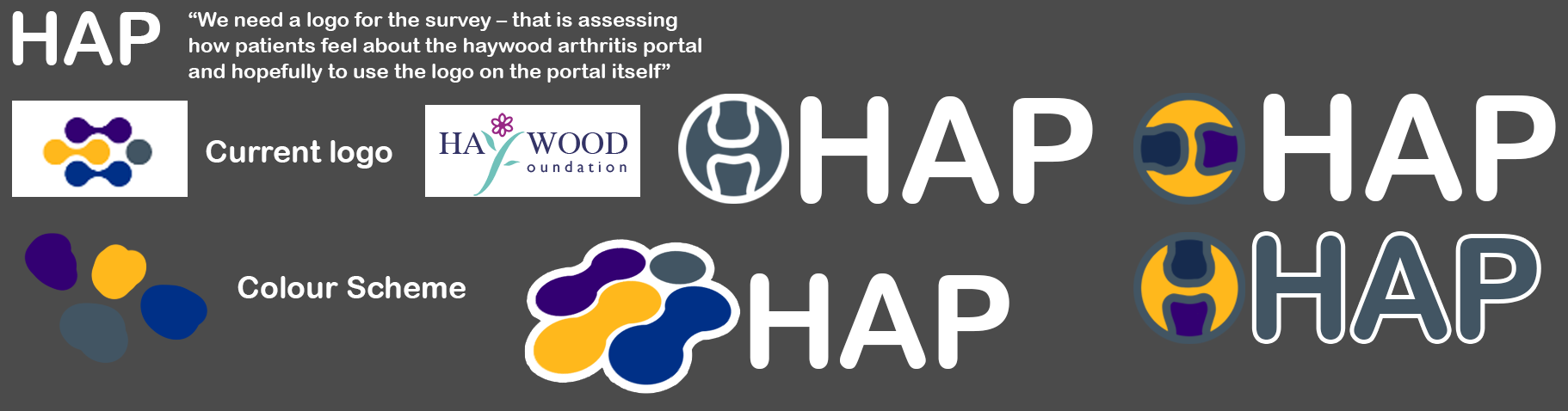
Haywood Arthritis Portal (HAP)
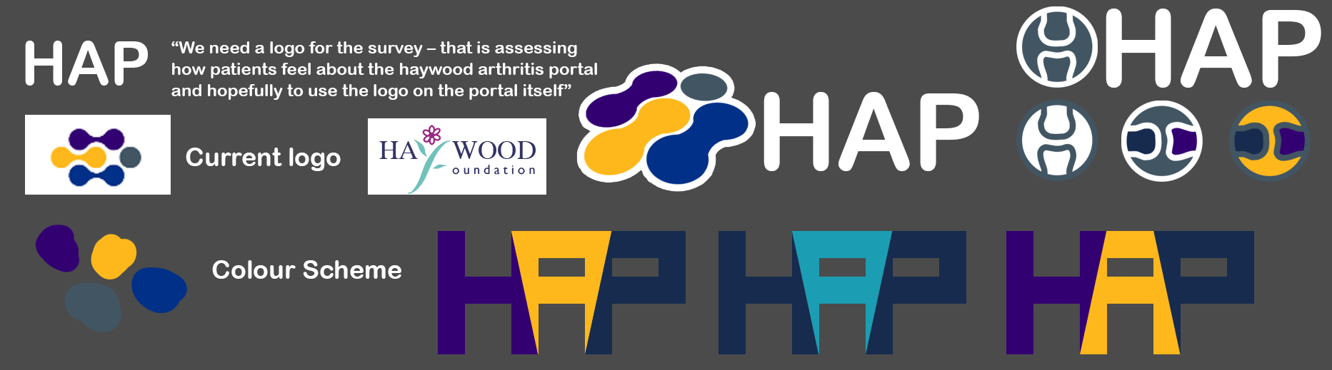
I was asked to create a new logo for the Haywood arthritis portal that would accompany a new survey that was getting released assessing how patients felt about the Haywood arthritis portal and for the logo to appear on the portal itself.
The client wanted to keep the same colour scheme as the current logo but, felt like they wanted something more modern.
media
both logos will be displayed on mobile / computer devices with occasional hard copy use.
HAP Concept ideas
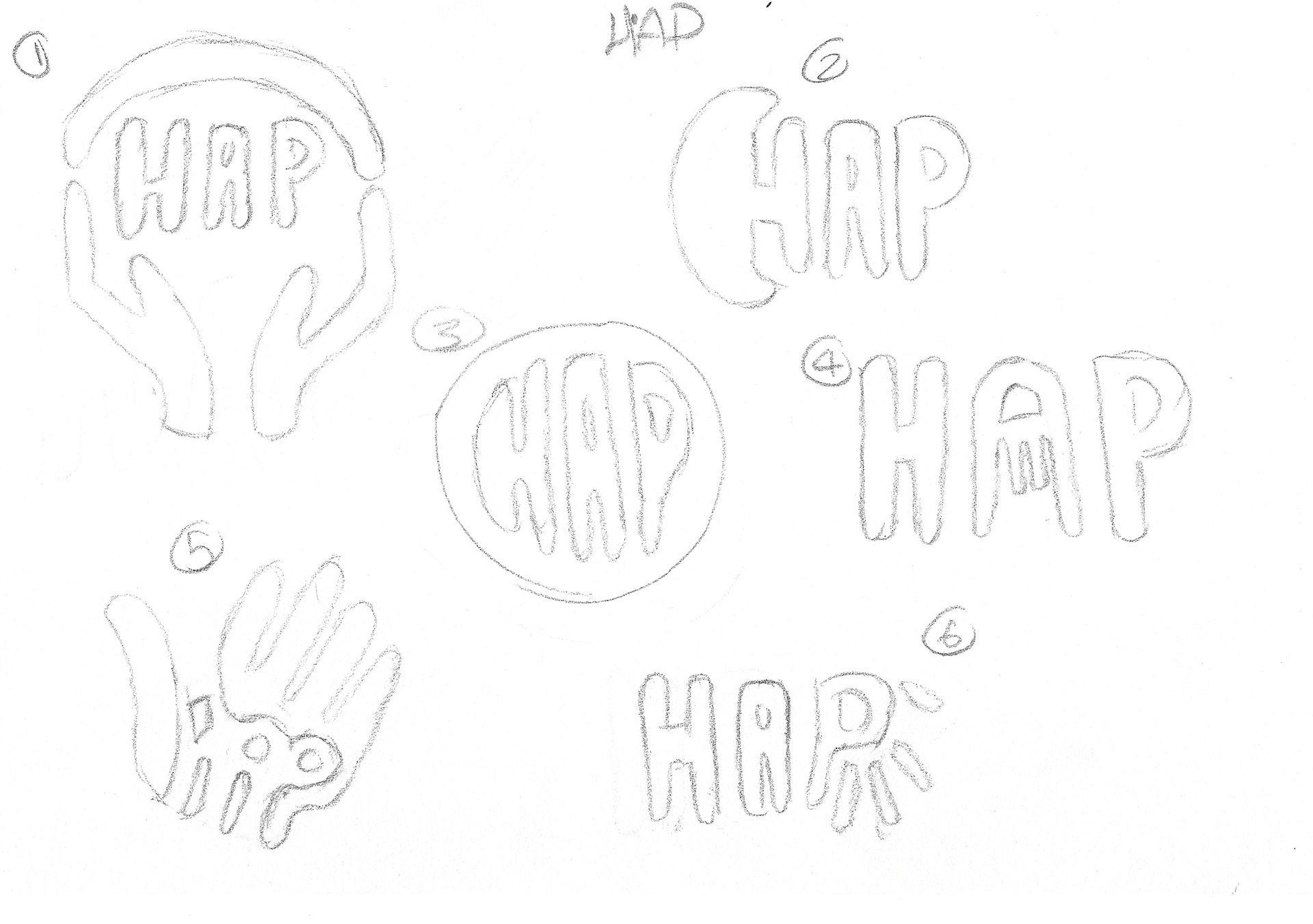
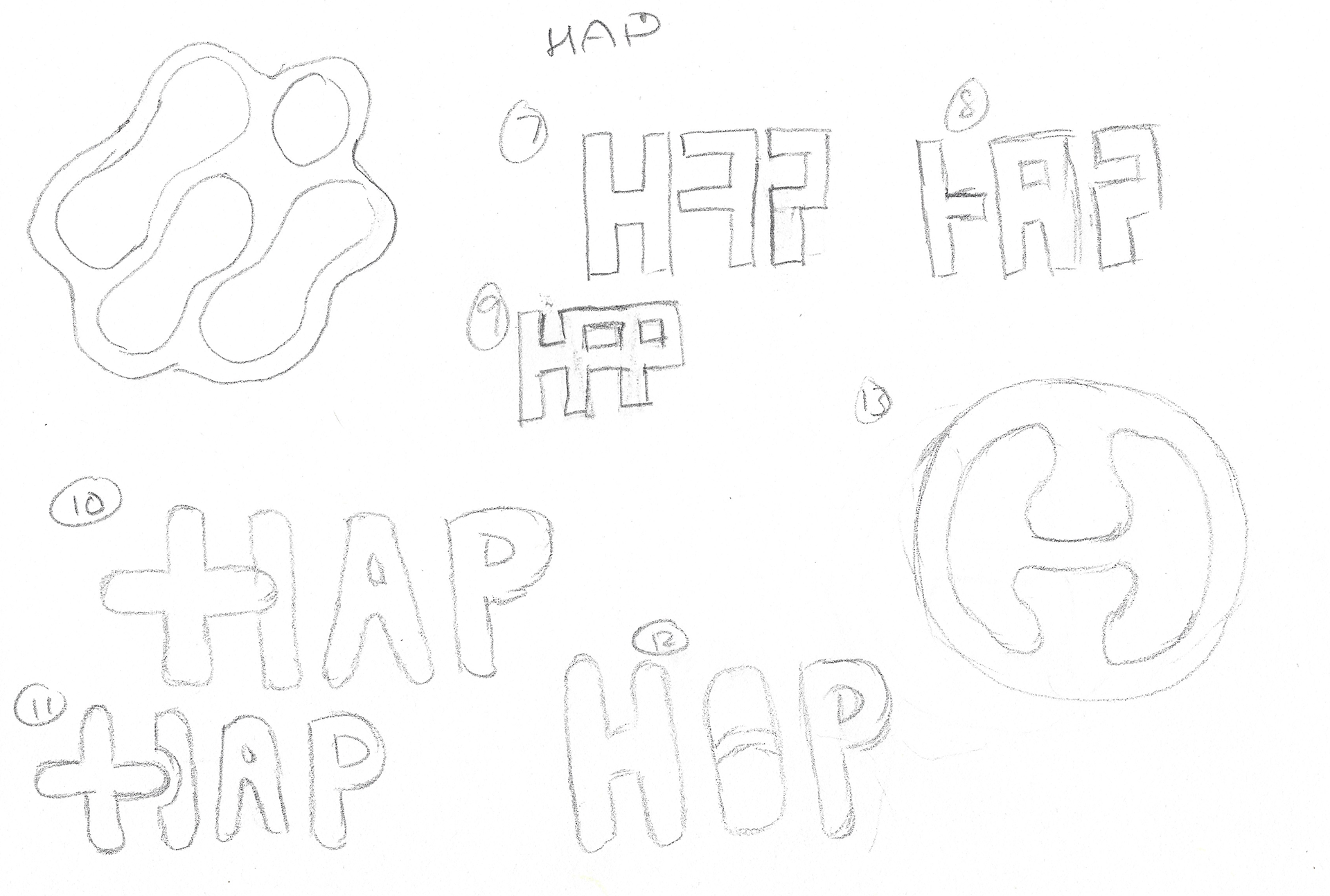
These are the concept ideas that were passed back to the client. these ideas were numbered as to aid in feedback and alteration discussions.
Digitising and adding colours
The ideas the client liked were 7,8,9 and 13.
After polishing up the designs a bit more in photoshop / illustrator I returned this board back to the client trying out the designs in different colour scheme combinations
Alterations based on feedback
The client narrowed down their preferred concept and asked about adding some text to the logo.

This is a mood board I created for the client to help narrow down what font style they were looking for.

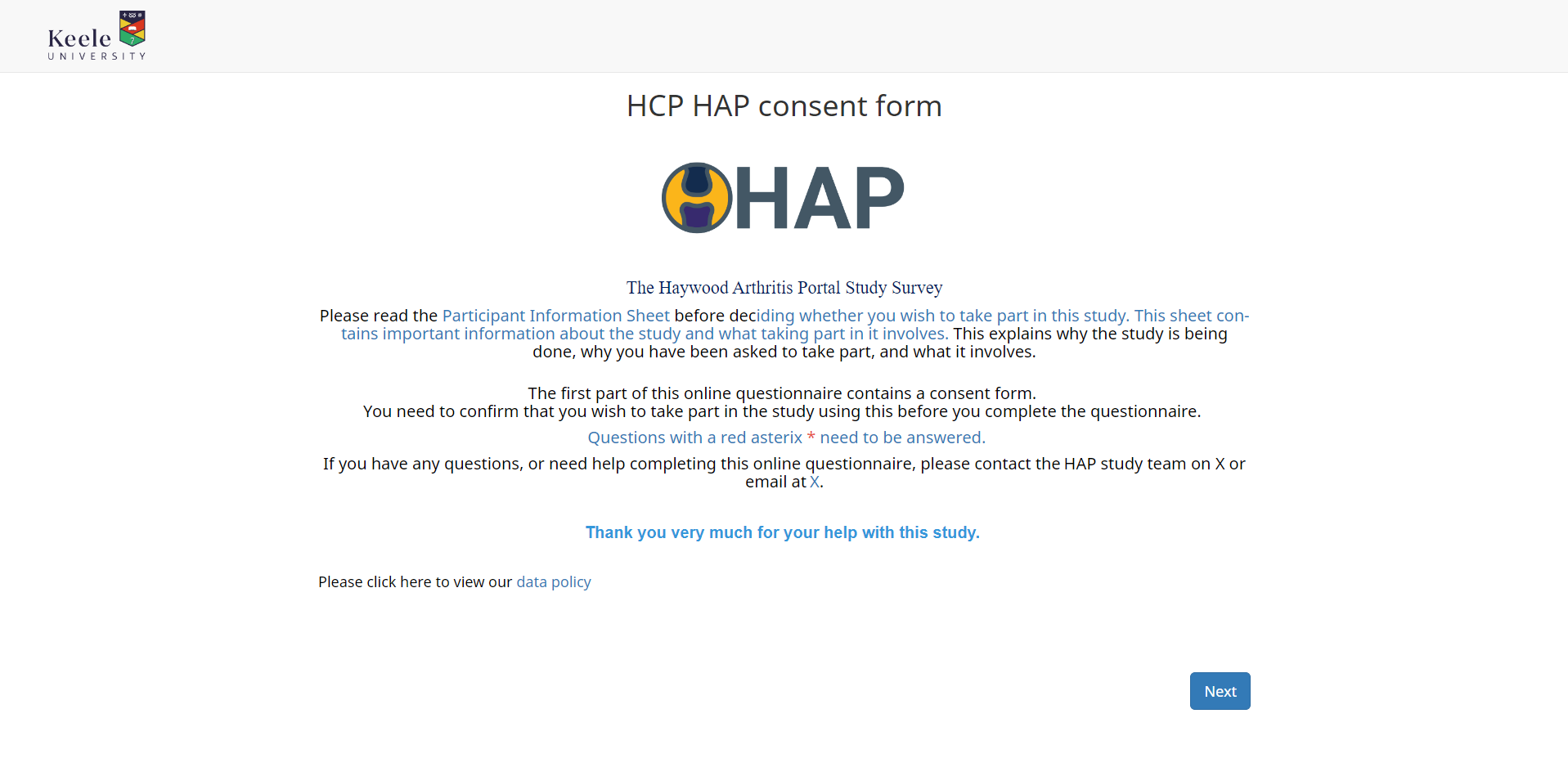
final design
this was the final design the client went with and was used on both the survey and on the portal as shown in the picture below.
the same client also asked me to create another logo for them, pain path, and later to create a banner for the lancet medical journal. explore my projects below to see more.