BRIEF & Concepts
I was approached by a previous client about designing a logo to go alongside her PHD;
“I mentioned needing a logo for my phd work thinking title will be Pain IDEA (Pain in Inflammatory arthritis and the relationship with DEpression and Anxiety). Essentially exploring the associations and potential bi-directional relationship as well as the impact of treating depression/anxiety on pain in IA. Was thinking maybe someone in pain, maybe with a tear and cloud bubble up with some representation of depression and anxiety and arrows showing bi-directional relationship.”
She followed this by sending over some designs she’d seen online and gave me a timeframe. I started off by looking at some design inspiration for myself and made notes about what colours and themes people had used in similar applications.
After this I drew some ideas and sent them over.


Digitising and adding colours
She chose 3 designs, 6, 8 & 12 to be digitised as well as pitching her own idea, shown above, as well as suggesting some other imagery that might work well with my designs and if I could add those too.
We also took this opportunity to discuss a colour palette. She gave the colours of red and blue but was happy for me to try other colours too and to keep in mind accessibility for people with colour blindness.
Fro
Alterations based on feedback
From the digitised designs we agreed that the concept she created fitted the project the best and moved into finalising the design. She was worried that all the about how colourful the design was and wanted something a bit more subtle. This involved moving some colours around as well as playing with the title at the bottom until we were both happy with the function and form.
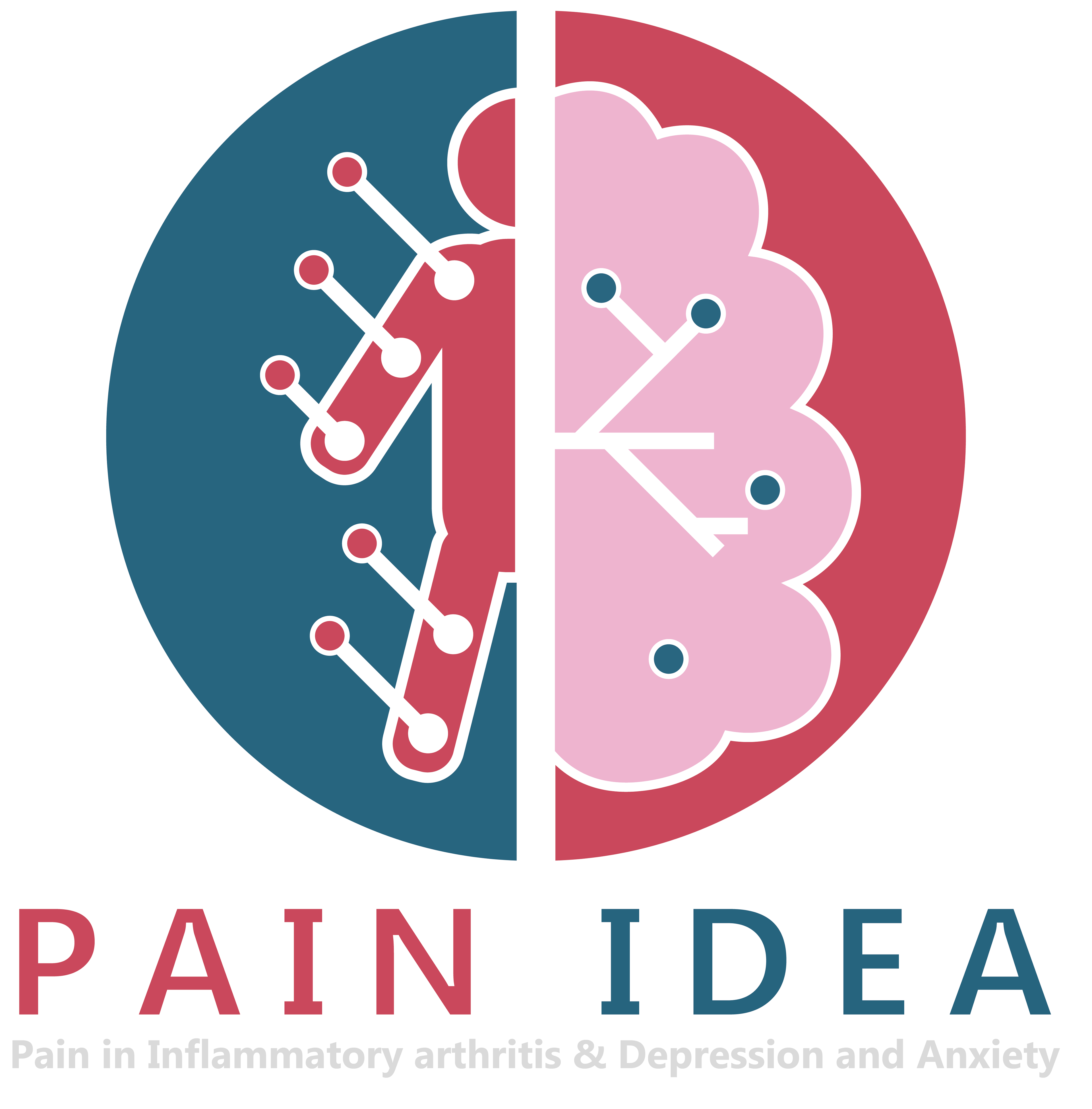
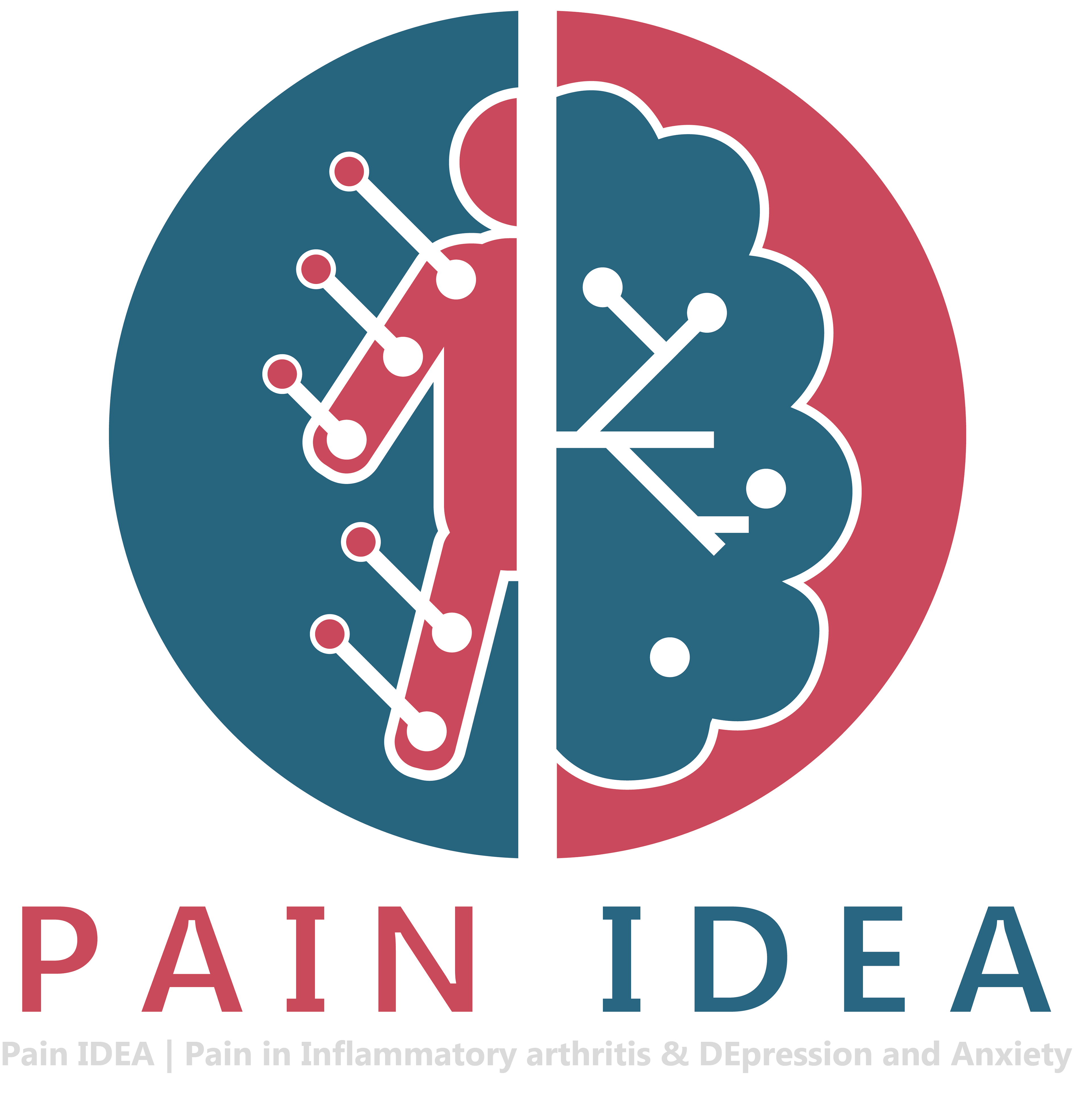
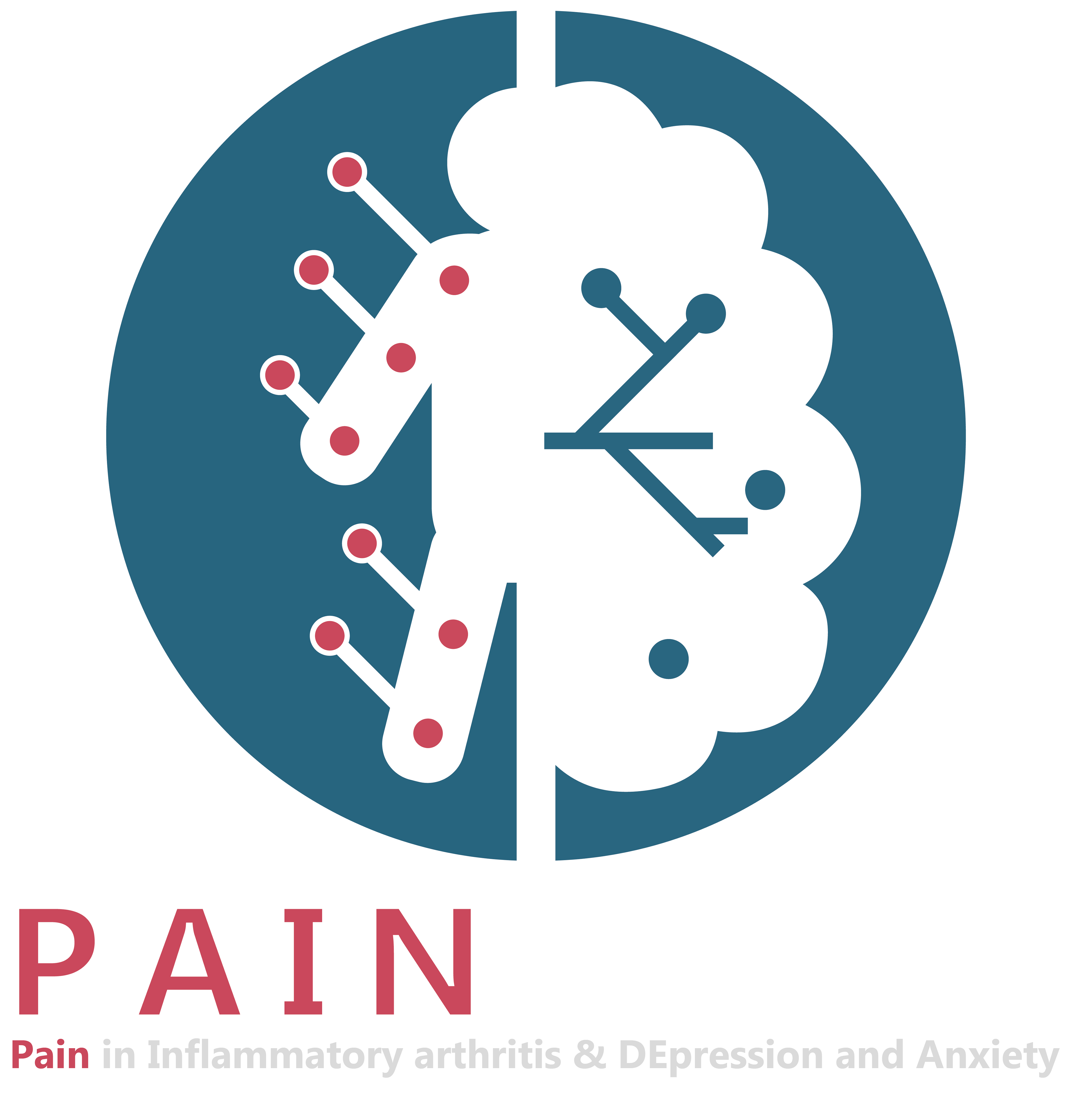
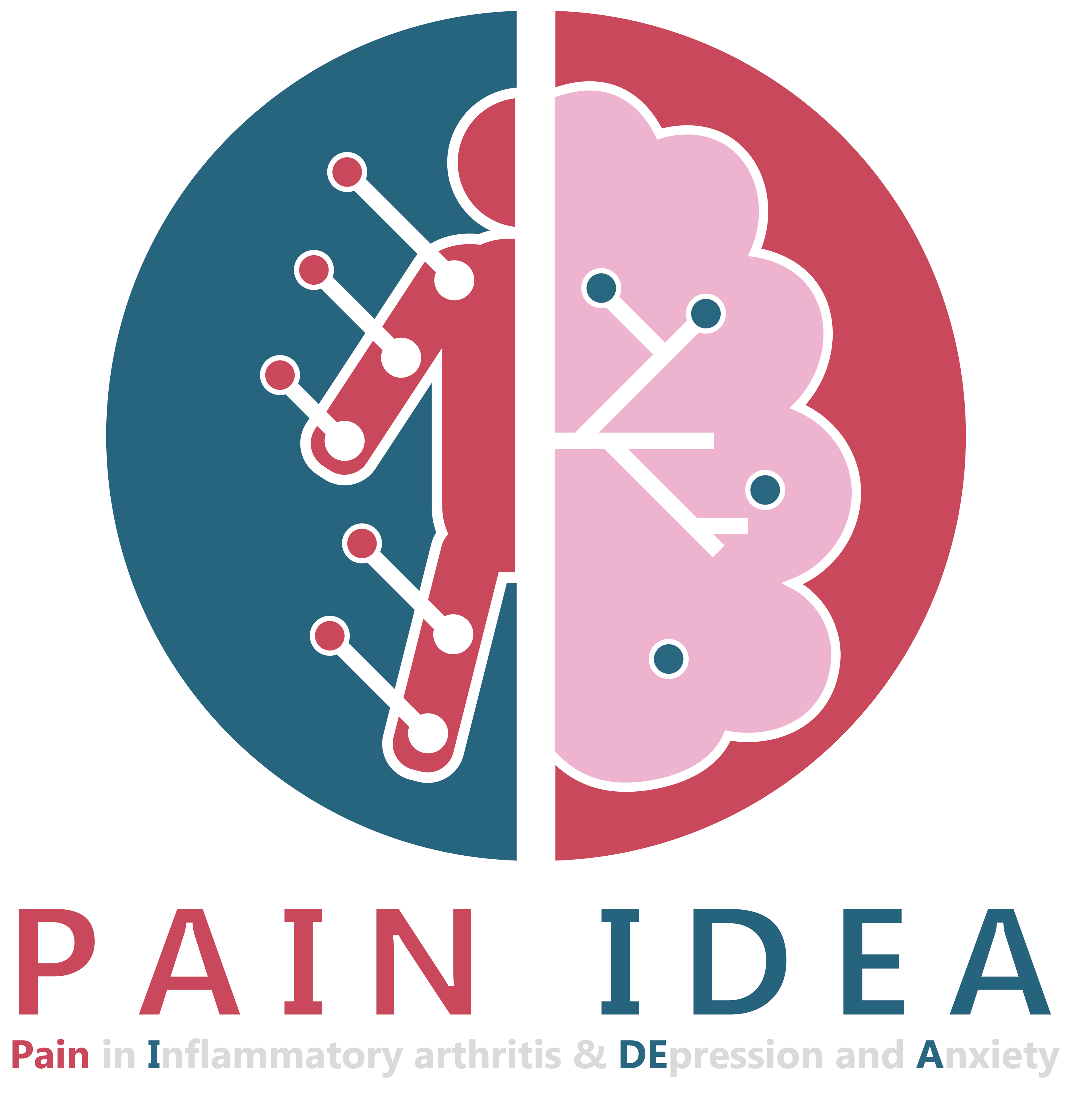
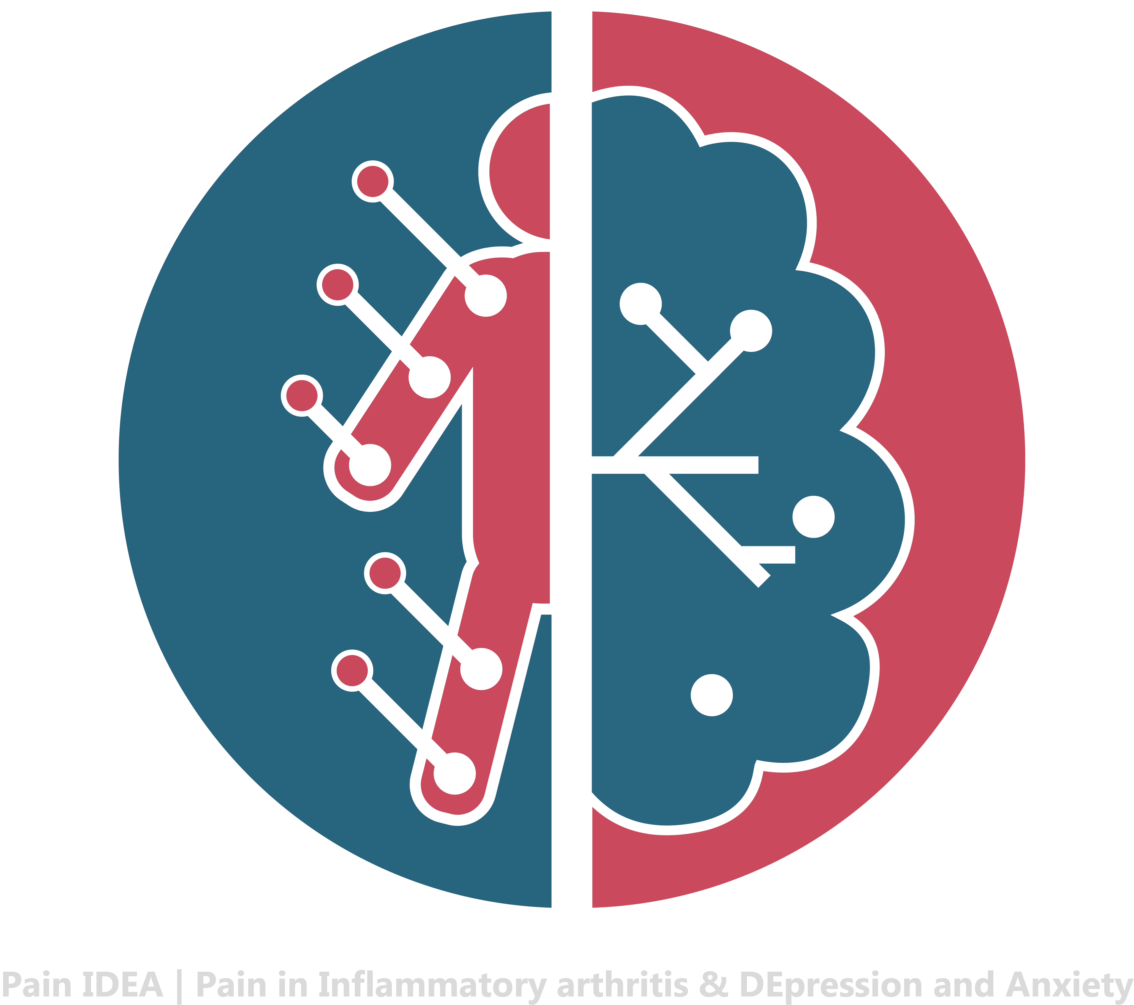
Final Design