Pain Path
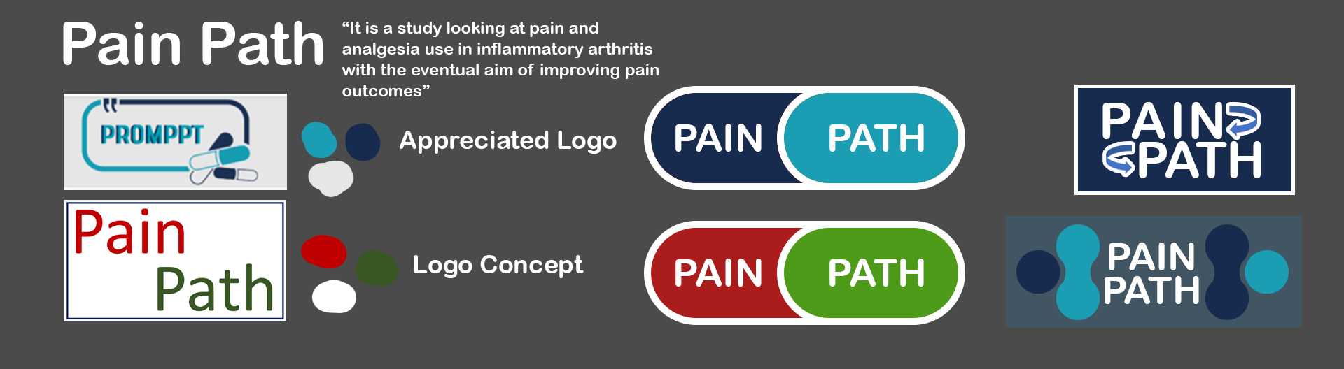
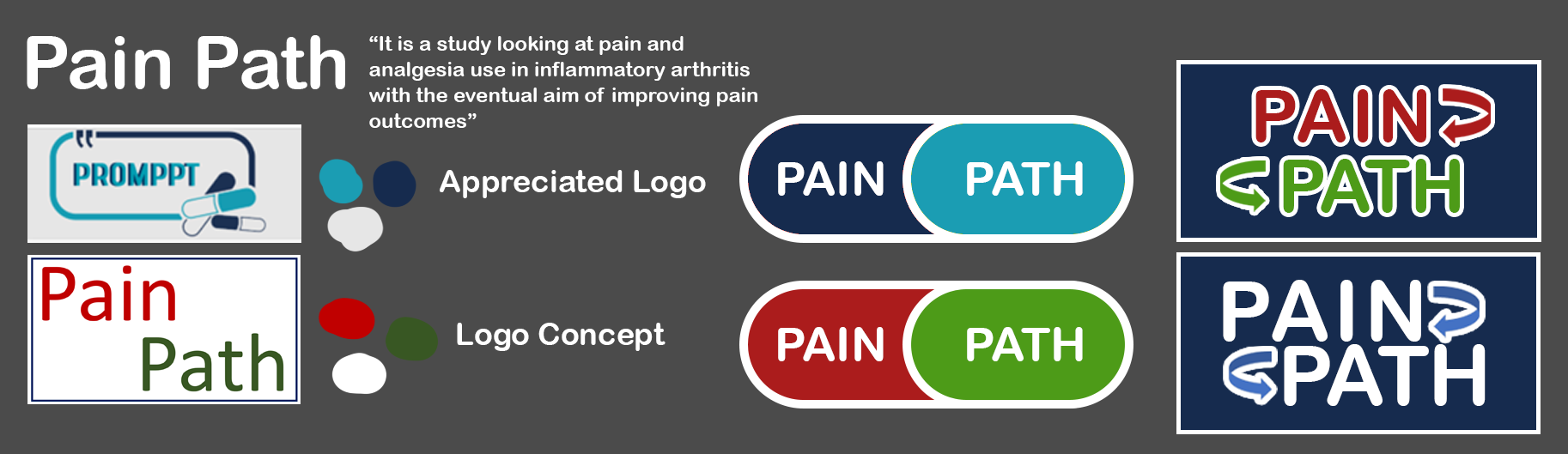
I was also asked to create another logo for the pain path study. pain path is a study looking at pain and analgesia use in inflammatory arthritis with the eventual aim of improving pain outcomes in patients.
The client has done a mock-up of what they are looking for in the new logo as they got inspiration from a similar study and felt like their old logo also needed modernisation.
media
both logos will be displayed on mobile / computer devices with occasional hard copy use.
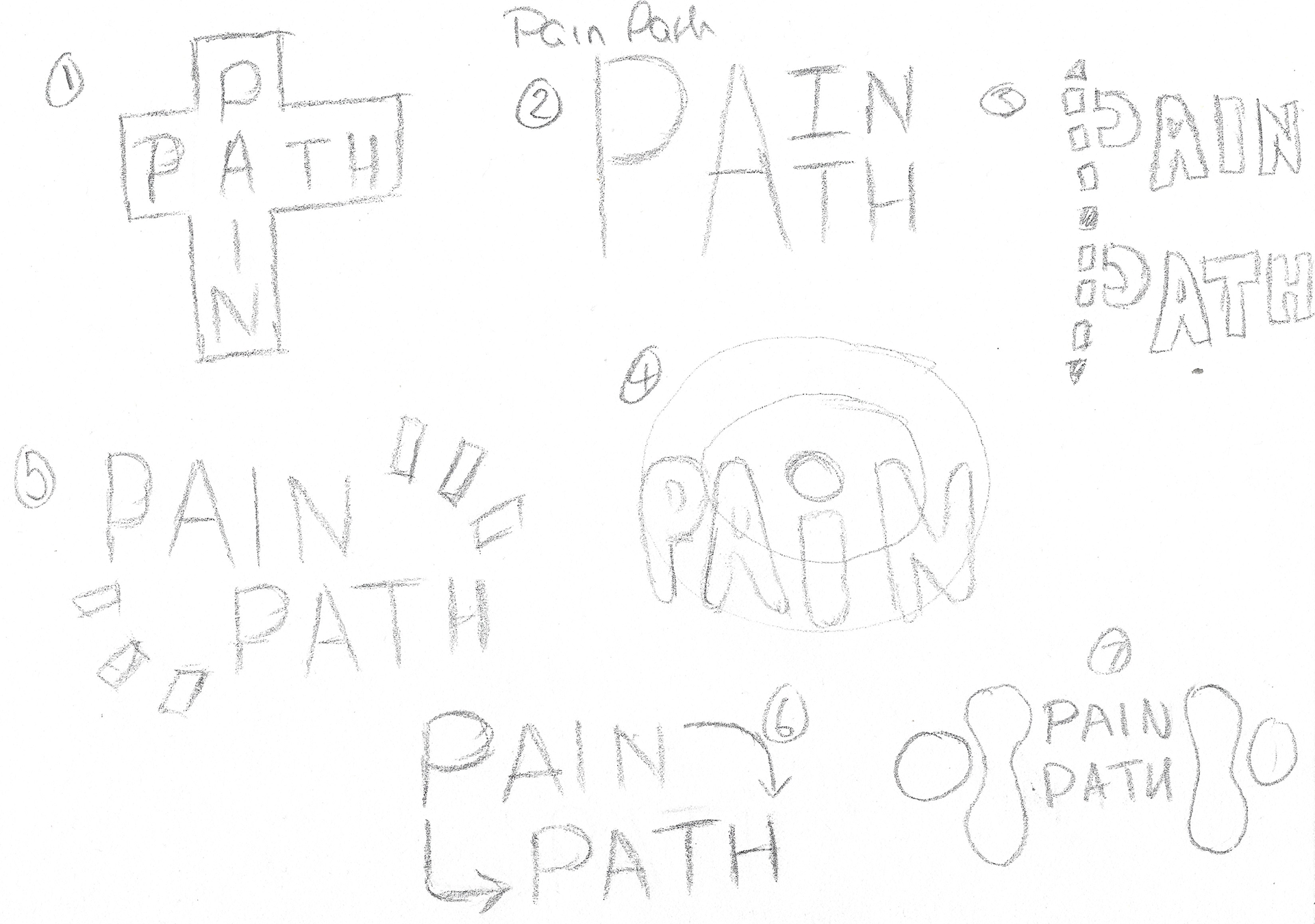
These are the concept ideas that were passed back to the client. these ideas were numbered as to aid in feedback and alteration discussions.
Digitising and adding colours
The ideas the client liked were 7,8 and 9.
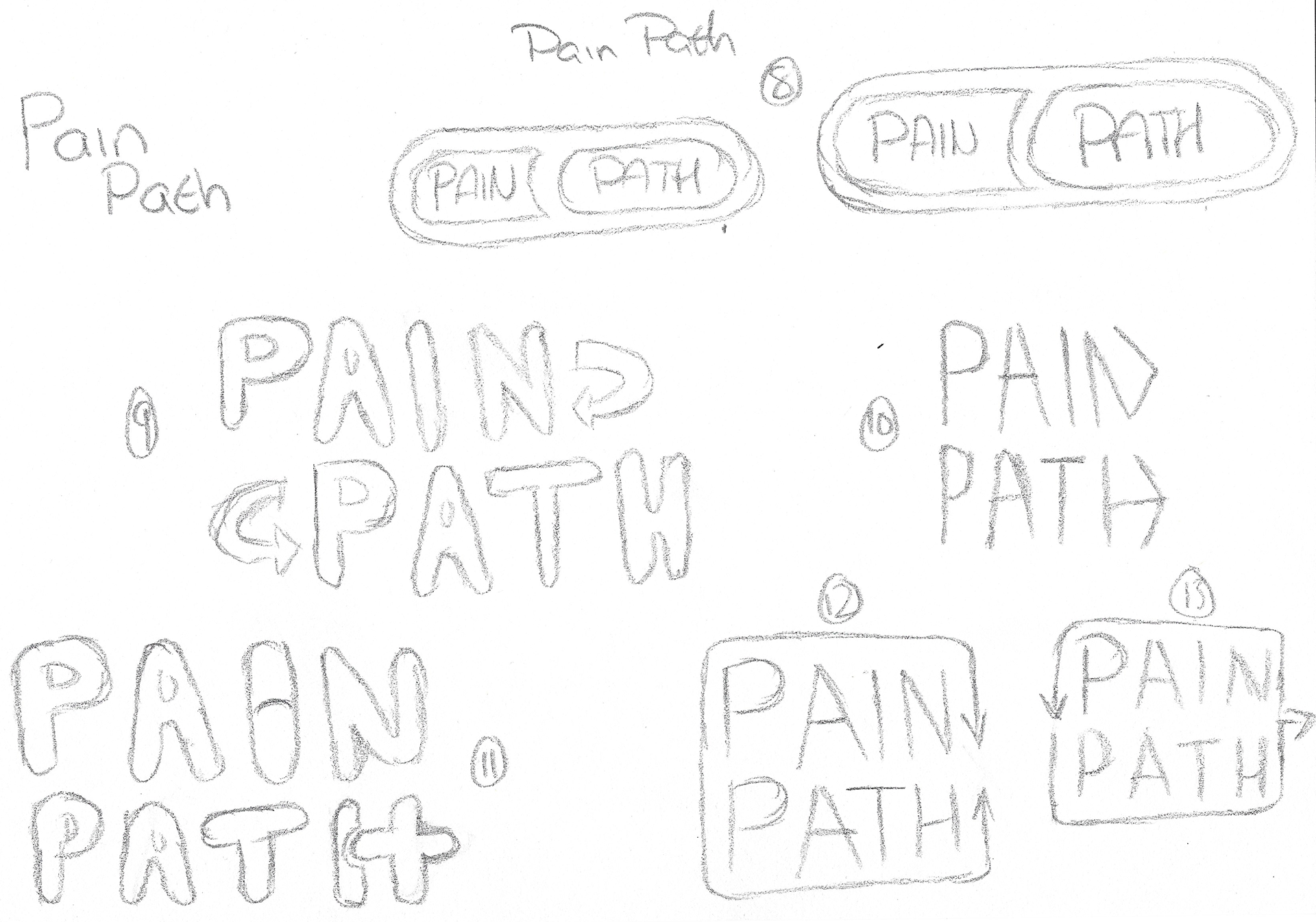
After polishing up the designs a bit more in photoshop / illustrator I returned this board back to the client trying out the designs in different colour schemes
Alterations based on feedback
The client narrowed down their preferred concept and required some persuading off the red and green colour scheme as i believed it could cause issues for the user
Finalising the design

the client didn't like having a background as part of the image and asked for some concepts without it. due to the design having a white outline and it appearing on a white webpage i showed what it would look like without the background.
this then created a new design that moved the arrows and text to be uniform with each other rather than the text being closer inline.
the client adjusted the colour scheme to take out the red and swap it for a less harsh orange. at this point i saw the opportunity to have the orange and blue complementary colours in the design over the green.
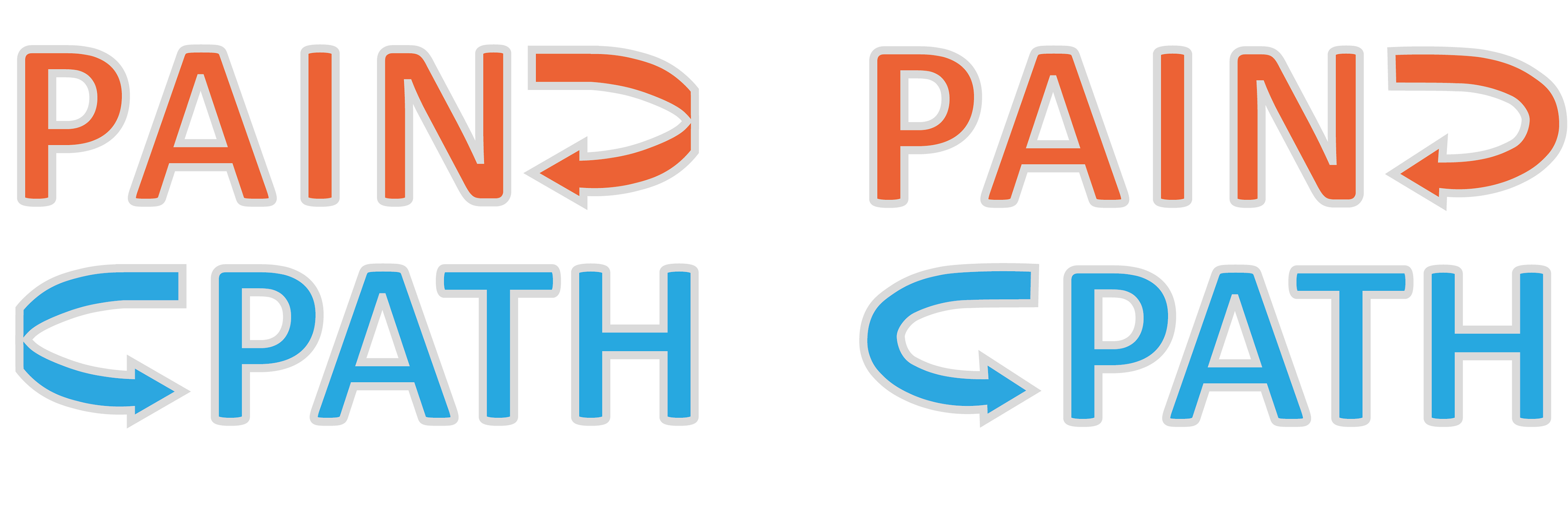
The client agreed on both the new colour scheme and the uniform shape but wasn't too sure about the arrows and asked for them to be filled out in the middle.
He also wanted the design to have a boarder around the text and the arrows.
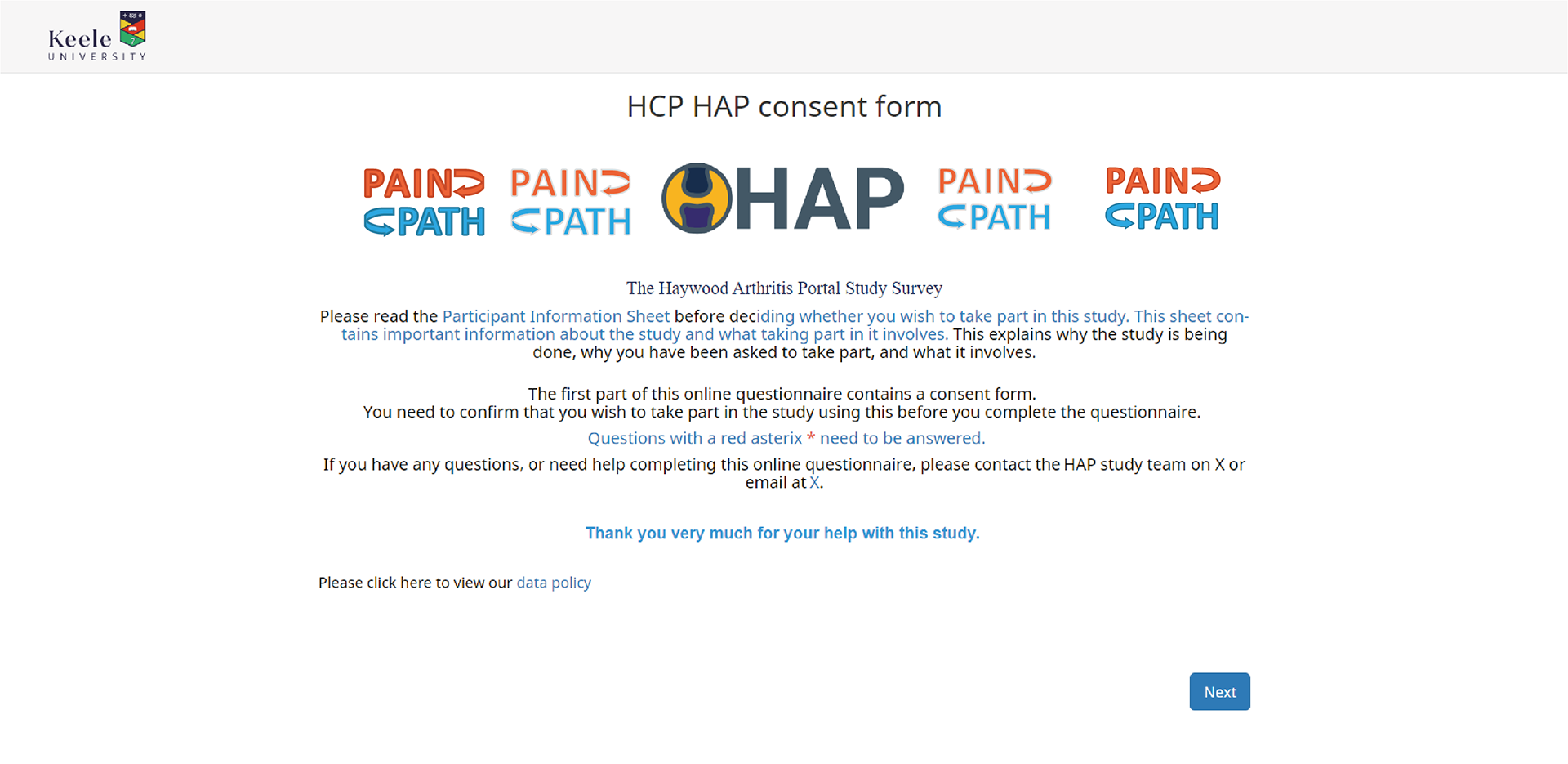
to help show what the concepts would look like i used one of their websites as they just published a new study using another one of the designs i created.
the pain path logos on the left have the original arrows but one has a grey boarder and the other a darker shade of the body colour.
on the right is the new arrows, one with a grey boarder and the other with the darker shade of the body colour arrows.

final design
this was the final design the client went with and used for the study.
the same client also asked me to create another logo for them, HAP, and later to create a banner for the lancet medical journal. explore my projects below to see more.